Bangkok, thailand
13:44 GMT+7
All Projects
Dashboard
Redesign
Mobile
Analytics Hub Transformation
Turning spreadsheets into a product decision center

Context
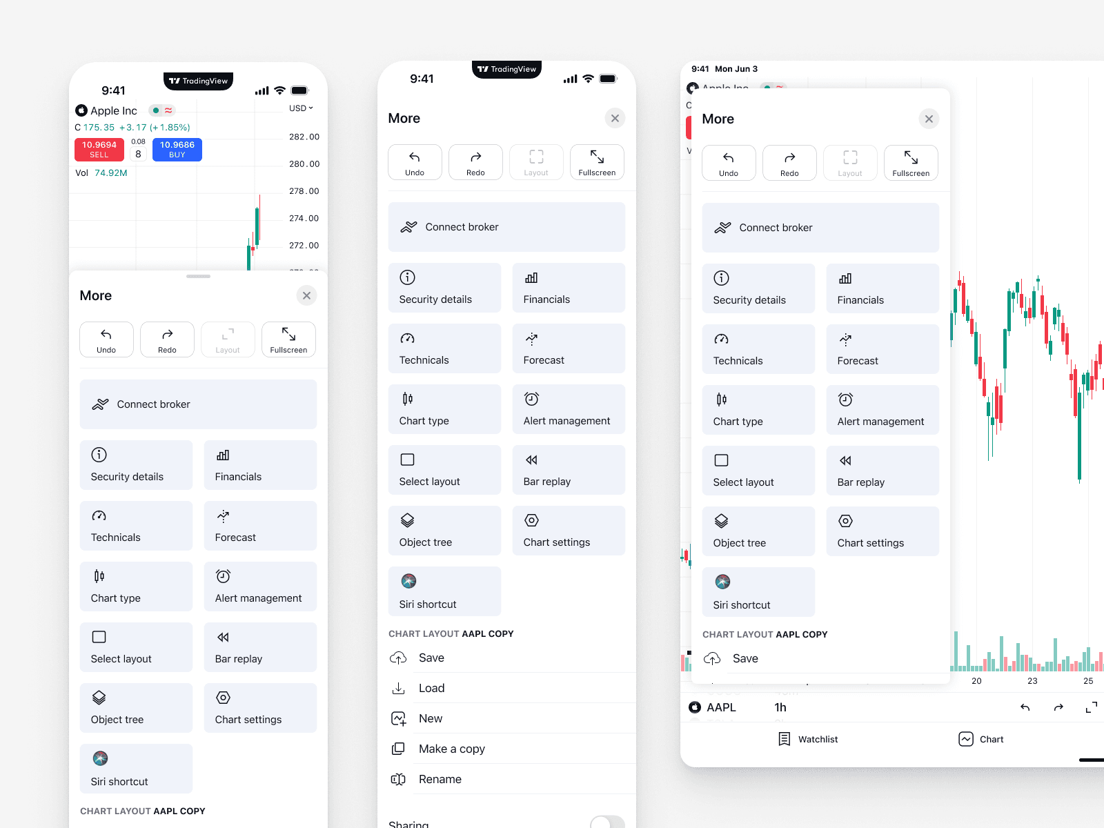
During our work on the TradingView platform, it became clear that the “More” sheet no longer met modern usability standards. It relied heavily on legacy components, felt visually outdated, and was difficult for both new and experienced users to navigate efficiently.
These issues directly affected usability, discoverability, and engagement. As a result, we decided to run a full analysis and redesign the sheet from the ground up, focusing on clarity, structure, and business impact.
Research and Analysis
During the research phase, several key problems were identified.
Overcrowded and constantly growing
The “More” sheet contained too many tools, and their number kept increasing — especially after the toolbar redesign.
This made the interface harder to scan and slowed down decision-making.
Business priorities were not visible
Some tools had a direct impact on monetization, such as Connect Broker and Bar Replay, but they were visually buried and easy to miss.
Important business-critical actions were treated the same as secondary tools.
Usage data insights
Product analytics revealed that certain actions were used significantly more often than others.
For example, users clicked “Maximize chart” an average of 74 times per month, yet it wasn’t easily accessible.
Lack of logical structure
Essential tools were scattered across the sheet, forcing users to spend unnecessary time navigating, searching, and switching context.
There was no clear grouping or prioritization.
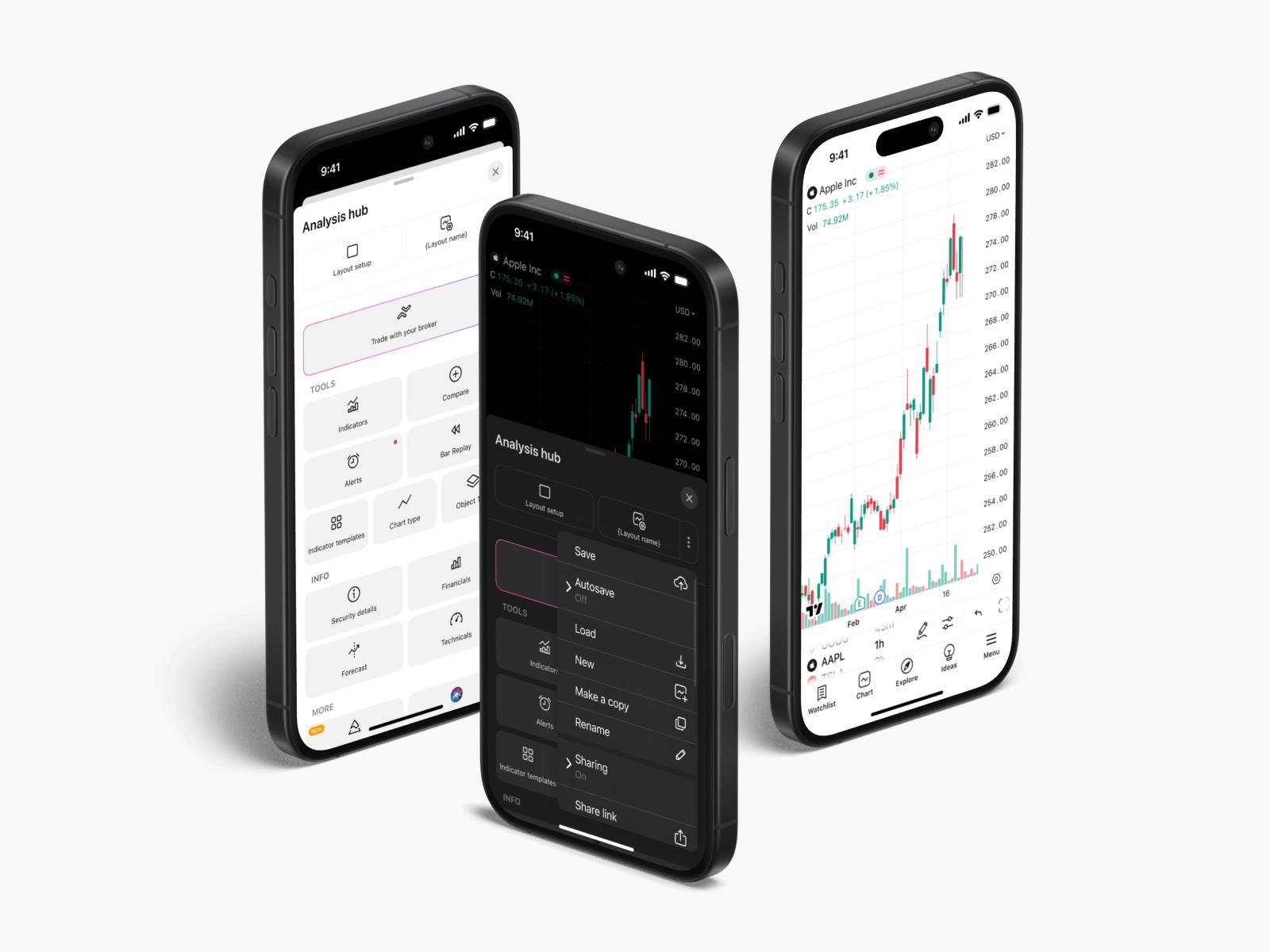
Design Solution
As part of the redesign, we introduced several structural and visual improvements.
Layout enhancements and visual optimization
Reduced tile title size to improve visual hierarchy and balance
Centered layout alignment to increase focus and scanability
Three-column structure to surface more key actions at once without clutter
These changes made the interface feel lighter, more structured, and easier to understand at a glance.
Tool grouping
All tools were reorganized into three clear categories:
Tools — Essential chart-related features such as Indicators, Chart Type, and Alerts
Info — Analytical and data-driven tools like Financials and Forecast
Other — Experimental or advanced tools such as Pine Editor and Siri Shortcuts
This grouping reduced cognitive load and improved navigation predictability.
Prioritization and sheet renaming
Several prioritization decisions were made based on usage data and business goals:
“Bar Replay” was moved higher in the hierarchy
“Connect Broker” received a highlighted outline to increase visibility
Layout actions like Maximize Chart, Undo, Redo, and Fullscreen were made instantly accessible
The sheet was renamed from “More” to “Analysis Hub” to better reflect its purpose
Results and Insights
The redesign delivered measurable improvements across key metrics:
+47% increase in Bar Replay usage
(peaked at +56% on iOS before stabilizing)+45% increase in paywall opens
as more users discovered premium features+12% growth in trial activations and purchases
driven by improved feature exposure
These results confirmed that better structure and prioritization directly impact engagement and monetization.
Conclusion
The Analysis Hub redesign significantly improved navigation, clarity, and access to essential tools.
By aligning interface structure with real user behavior and business priorities, we were able to increase engagement and create a more scalable foundation for future growth.
Further iterations and refinements are planned based on ongoing user behavior analysis.