Bangkok, thailand
13:44 GMT+7
All Projects
MVP
Dashboard
SaaS
Optimization
Web
Farm Operations Web Dashboard
Daily actions and herd overview in browser

Context
Alpaca Guild originally existed as a system for alpaca management and registry, offering tools to track animals and their history. The mobile app aimed to extend this functionality into a on-the-go tool that makes farm management easier and more organized.
The key audience included alpaca owners and farmers, many of whom are 50+ years old and may experience friction with complex digital interfaces. The app’s design needed to prioritize clarity, readability, and ease of use.
My Role
I led the UX/UI design process for the Alpaca Guild mobile application concept.
My responsibilities included:
Defining core user needs and flows for farm management features
Designing wireframes and interactive prototypes
Creating final UI screens with a focus on accessibility
Testing and refining interactions based on usability considerations
The primary focus was to structure data-heavy content in a way that feels i
ntuitive and approachable.
Problem
Farm management tools often struggle with:
Information overload — users must access many different data points about animals, schedules, and health records.
Complex navigation — traditional tools require too many taps or unclear menus to reach key information.
Accessibility barriers — older users can have difficulty with small text or low-contrast UI.
For Alpaca Guild, this meant designing a mobile experience that minimizes cognitive load and aligns with farmers’ daily tasks.
Goals
The project aimed to:
Simplify data access for herd and animal records
Create interfaces that are easy to understand at a glance
Prioritize readability with larger typography and high contrast
Enable users to perform key actions quickly on mobile devices
Process
User Research & Audience Analysis
I started by analyzing the target user group, focusing on their typical tasks and pain points. This informed decisions around text size, interface structure, and navigation clarity.
Information Architecture
I mapped core features into clear sections:
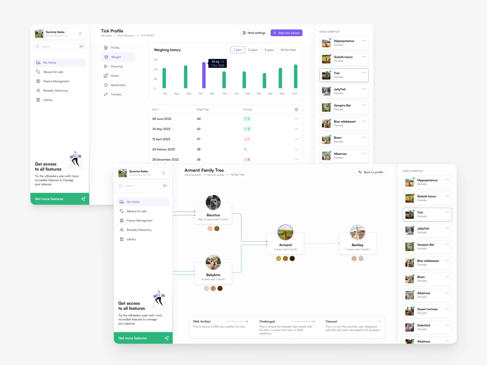
Animal profiles (weight, health history, family tree)
Herd overview dashboard
Daily activities and alerts
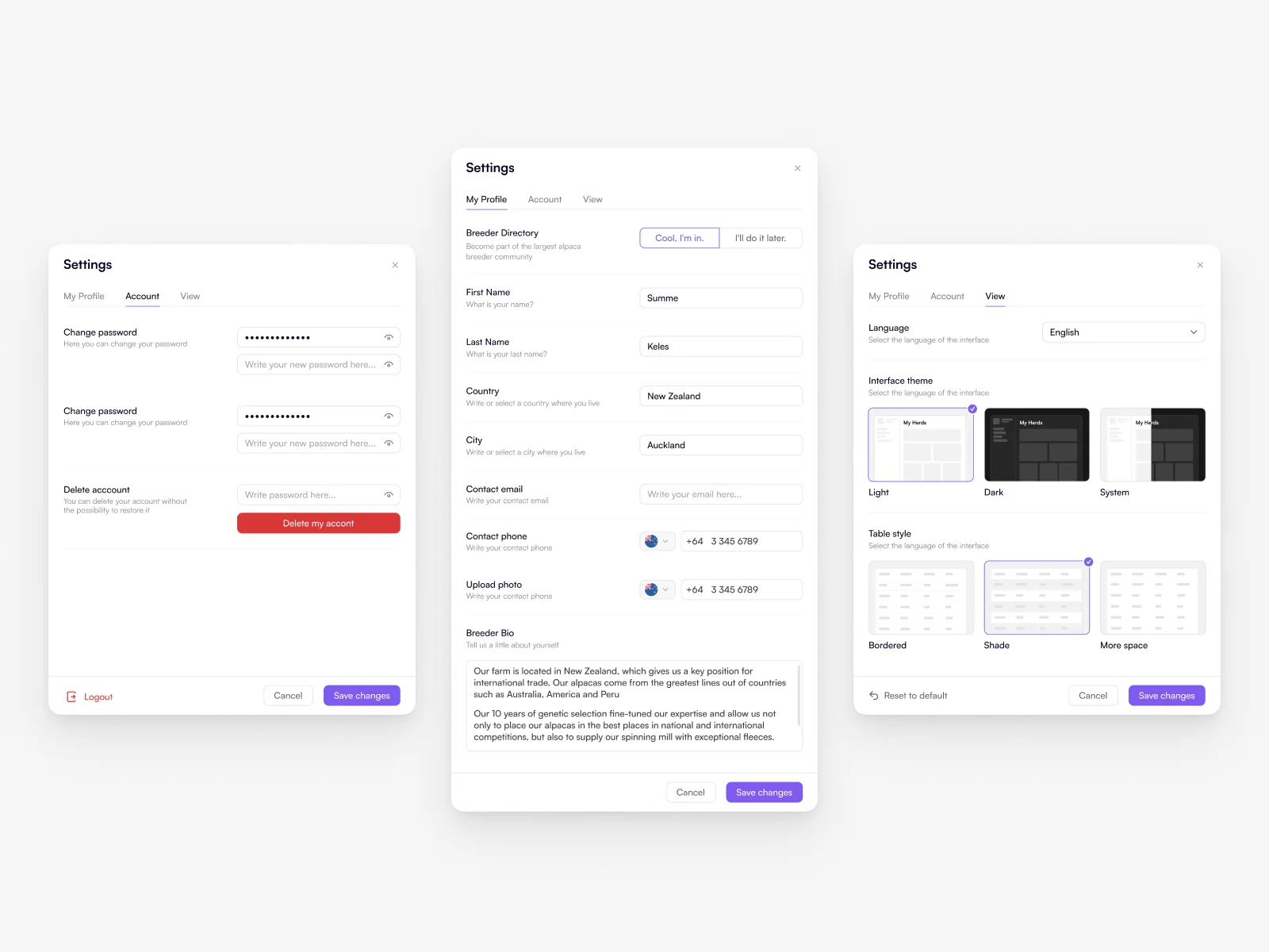
Settings and data filtering
This helped ensure users could find what they needed without confusion.
UI Design & Accessibility
The UI was designed with:
Large typography for readability
High contrast elements for visibility
Simple iconography and visual cues for navigation
Consistent layout patterns across screens
These choices make the app usable even for users unfamiliar with modern mobile interfaces.
Solution
The mobile design delivers a balanced combination of simplicity and functionality. Users can:
Quickly view herd data and animal details
Navigate through key tasks with minimal cognitive effort
Understand complex information through structured layout
Interact confidently thanks to accessibility-focused design
The result is a tool that feels practical and approachable, even for users with limited experience in digital products.
Project Status
Alpaca Guild was implemented and launched as a working product.
The design was built for real workflows and real users, with a strong focus on clarity, accessibility, and everyday usability.
This wasn’t just a concept—key design decisions were validated in practice through a shipped experience, especially around information hierarchy, readability, and simplified navigation.
Result
This case demonstrates my ability to:
Translate complex workflows into intuitive mobile experiences
Design for accessibility and diverse user abilities
Create interfaces that balance functional depth with clarity
Structure data-rich content for efficient daily use
Alpaca Guild reflects a design approach grounded in user empathy, clear information hierarchy, and practical usability solutions — especially for audiences new to digital tools.
Concept Innovation
I strongly believe in continuous improvement and iterative design.
In my spare time, I created a future-oriented concept for Alpaca Manager, exploring potential visual and usability updates beyond the current product.
This concept focused on:
modernizing the visual language
refining layout and hierarchy for faster scanning
adapting the interface to evolving user needs and expectations
While not part of the released product, this work reflects my commitment to creative exploration, long-term product thinking, and proactively improving existing solutions.