Bangkok, thailand
13:44 GMT+7
All Projects
Redesign
Landing page
Optimization
SaaS
High-Conversion Landing Redesign
Redesign of the Koalendar booking page to improve clarity, conversion, and user engagement.

Context
Koalendar is a simple scheduling platform used for appointments and booking workflows. Users share a booking link so clients, partners, or colleagues can schedule meetings easily and without conflicts.
The original booking page worked functionally, but its messaging and visual structure made it difficult for new visitors to quickly understand the product’s value and take action.
My Role
I worked on the landing page redesign and UX refinement for Koalendar’s booking experience.
My responsibilities included:
Clarifying the value proposition
Restructuring content for better readability and flow
Redesigning visuals to feel modern and trustworthy
Improving call-to-action hierarchy and placement
This was a conceptual redesign focused on improving first impressions and usability.
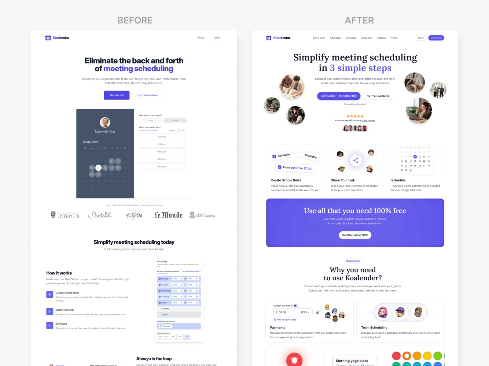
Problem
The existing booking page had several usability and conversion issues:
Unclear messaging
Visitors did not immediately understand what Koalendar does or how it differs from similar tools.Outdated visual design
The interface lacked visual hierarchy and felt less credible.Weak conversion signals
Primary actions were not prominent or well positioned within the layout.
Together, these issues reduced user confidence and made conversion harder.
Process
Clarifying the value proposition
I rewrote the main headline and supporting copy to clearly communicate:
what the product does
who it is for
why it is useful
The goal was to help users understand the core benefit within the first few seconds.
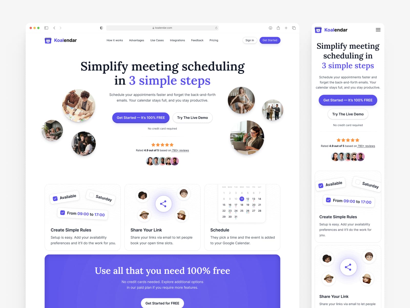
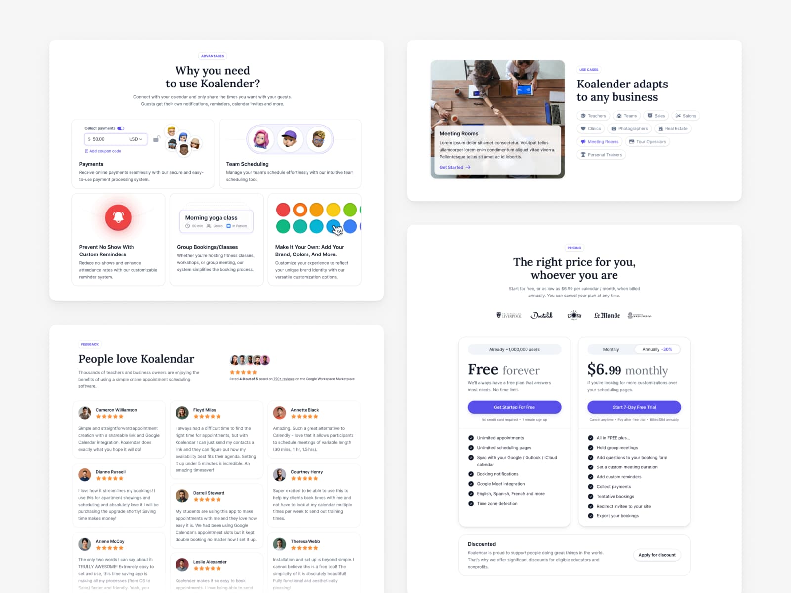
Visual redesign
I refreshed the visual language to better align with modern SaaS expectations:
improved typography and spacing
clearer color hierarchy
a more structured and balanced layout
This helped the page feel cleaner, more professional, and easier to scan.
Call-to-action optimization
I redesigned and repositioned CTAs so users always have a clear next step.
Key actions are visible above the fold and repeated at natural scroll points throughout the page.
Content structure
I reorganized the content to focus on benefits rather than features, addressing common scheduling pain points and guiding users toward action in a logical order.
Solution
The redesign addressed the main issues by:
making the product value clear at first glance
improving trust through a modern visual style
guiding users with strong visual hierarchy
supporting conversion with clear and consistent CTAs
Project Status
This project was created as a design concept and was not implemented.
The focus was on exploring how UX, visual hierarchy, and content clarity could improve conversion on a booking page.
Result
Although the redesign was not launched, this project demonstrates a user-centered approach to improving landing-page clarity and conversion.
It highlights my ability to:
identify UX and communication problems
translate business goals into clear design decisions
structure content for better understanding and flow
design interfaces that support user decision-making