Bangkok, thailand
13:44 GMT+7
All Projects
SaaS
MVP
Design system
Optimization
Mobile
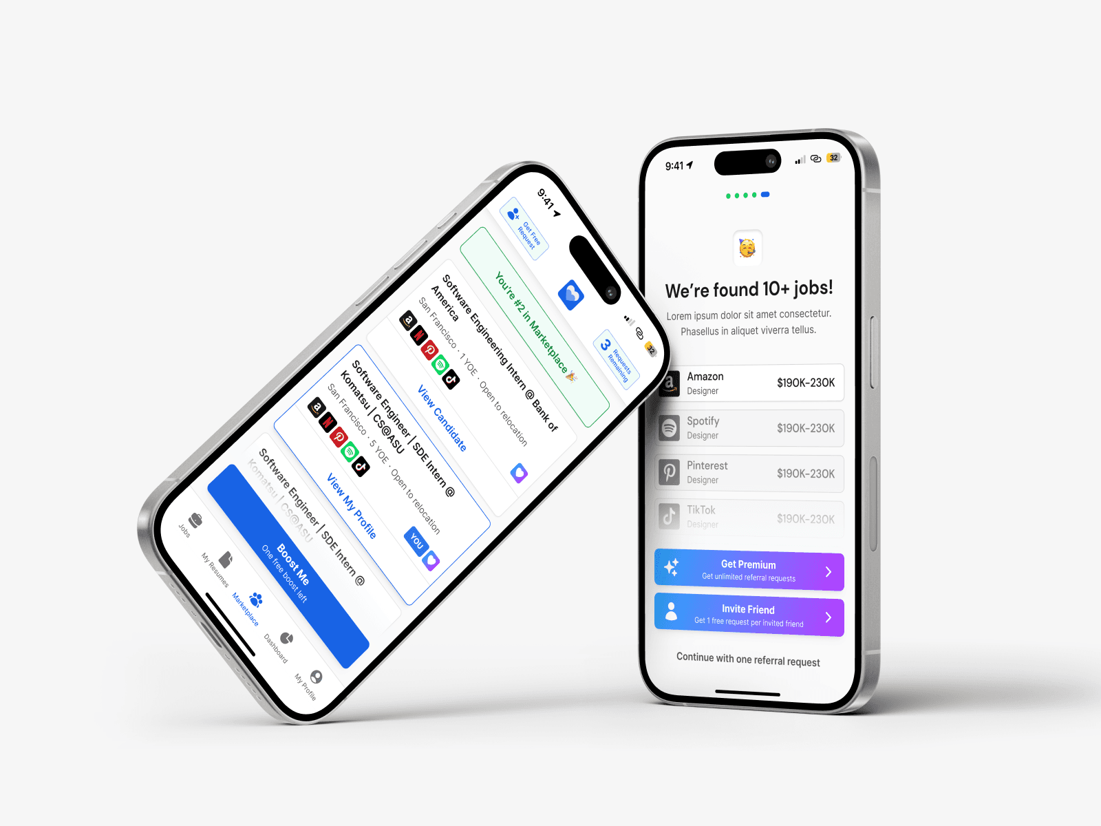
Referral App for Careers
A mobile app concept for job searching through employee referral networks
Context
Refer Me helps candidates use their professional network to find a job.
The app shows where users have connections inside companies they’re interested in and allows them to reach out or request a referral in a fast and transparent way.
The main idea is to replace cold applications with warm, human connections.
My Role
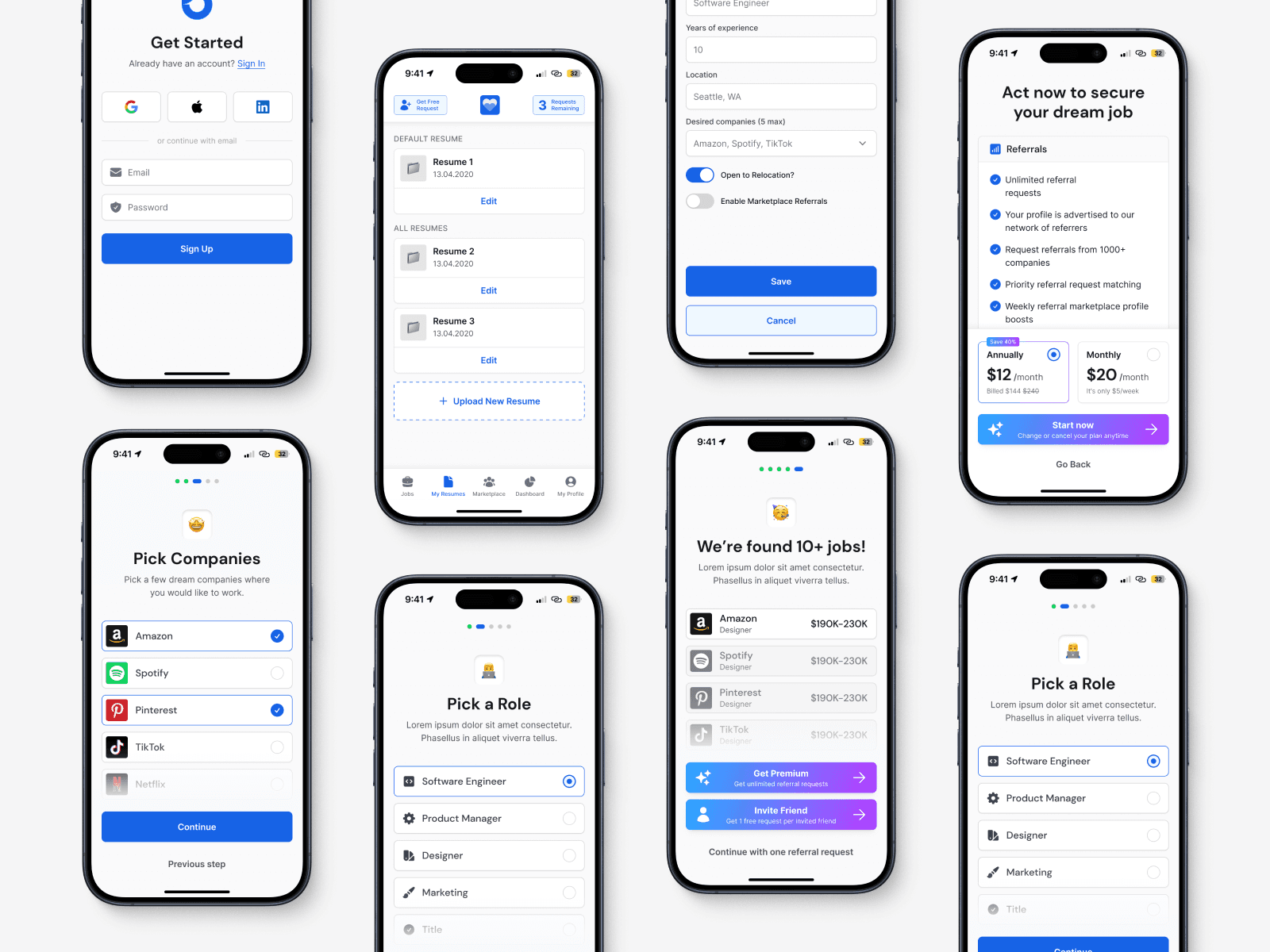
I was responsible for the end-to-end UX/UI design of the mobile app:
Defining user flows and core scenarios
Designing wireframes and prototypes
Creating final UI screens
My goal was to keep the experience simple, focused, and easy to understand, even when working with complex data.
Problem
Traditional job platforms create friction for users:
It’s hard to understand which companies are truly relevant
Professional connections are difficult to use effectively
The path from search to application feels long and unclear
The challenge was to reduce complexity and guide users smoothly from opening the app to sending a referral-based application.
Main Goals
Resume upload experience
Make uploading and managing resumes fast and effortless.
User profile management
Allow users to easily edit their experience, skills, and connections.
Job applications
Enable quick applications and clear tracking of application statuses.
Process
1. Research
I started by analyzing existing referral and job-search platforms to understand their strengths and weaknesses.
The focus was on identifying friction points and opportunities to simplify referral-based hiring.
2. User flows
I built detailed user flows for the main scenarios:
Onboarding and resume upload
Browsing companies
Viewing available connections
Applying for a position through a referral
This helped me spot bottlenecks early and improve navigation logic.
3. Wireframes & prototypes
I created low-fidelity wireframes to quickly test ideas and iterate on structure and logic.
This stage allowed fast experimentation without being locked into visual details.
4. Final UI design
Based on the validated flows, I designed the final UI screens:
Clear screen hierarchy
Strong focus on primary actions
Clean and minimal visual language
Solutions
Step-by-step data input
Users complete their profile gradually, without being overwhelmed.Interactive guidance
Visual hints and contextual feedback help users stay confident and engaged.Quick access to key information
Profile details, connections, and application statuses are always easy to find.
Result
Although Refer Me was not launched, the project became a strong UX case study focused on solving a real user problem — helping people find jobs through trusted connections.
It helped validate key assumptions, explore multiple design directions, and refine my approach to building clear, user-centered experiences for complex flows.
Even without a launch, this project reinforced the importance of designing the full journey, not just individual screens — and making every step feel intentional and easy to understand.